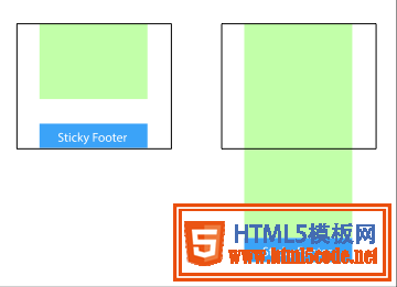
頁腳置底(Sticky footer)就是讓網(wǎng)頁的footer部分始終在瀏覽器窗口的底部。
當(dāng)網(wǎng)頁內(nèi)容足夠長以至超出瀏覽器可視高度時(shí),頁腳會(huì)隨著內(nèi)容被推到網(wǎng)頁底部;但如果網(wǎng)頁內(nèi)容不夠長,置底的頁腳就會(huì)保持在瀏覽器窗口底部。
方法一:將內(nèi)容部分的margin-bottom設(shè)為負(fù)數(shù)
<div class="wrapper">
    <!-- content -->
    <div class="push"></div>
</div>
<div class="footer">footer</div>
html, body {
  margin: 0;
  padding: 0;
  height: 100%;
}
.wrapper {
  min-height: 100%;
  margin-bottom: -50px; /* 等于footer的高度 */
}
.footer, .push {
  height: 50px;
}
1、這個(gè)方法需要容器里有額外的占位元素(div.push)。
2、div.wrapper的margin-bottom需要和div.footer的-height值一樣,注意是負(fù)height。
方法二:將頁腳的margin-top設(shè)為負(fù)數(shù)
給內(nèi)容外增加父元素,并讓內(nèi)容部分的padding-bottom與頁腳的height相等。
<div class="content">
  <div class="content-inside">
    <!-- content -->
  </div>
</div>
<div class="footer">footer</div>
html, body {
  margin: 0;
  padding: 0;
  height: 100%;
}
.content {
  min-height: 100%;
}
.content-inside {
  padding: 20px;
  padding-bottom: 50px;
}
.footer {
  height: 50px;
  margin-top: -50px;
}
方法三:使用calc()設(shè)置內(nèi)容高度
<div class="content">
  <!-- content -->
</div>
<div class="footer">footer</div>
.content {
  min-height: calc(100vh - 70px);
}
.footer {
  height: 50px;
}
這里假設(shè)div.content和div.footer之間有20px的間距,所以70px=50px+20px
方法四:使用flexbox彈性盒布局
以上三種方法的footer高度都是固定的,如果footer的內(nèi)容太多則可能會(huì)破壞布局。
<div class="content">
  <!-- content -->
</div>
<div class="footer">footer</div>
html {
  height: 100%;
}
body {
  min-height: 100%;
  display: flex;
  flex-direction: column;
}
.content {
  flex: 1;
}
方法五:使用Grid網(wǎng)格布局
<div class="content">
  <!-- content -->
</div>
<div class="footer">footer</div>
html {
  height: 100%;
}
body {
  min-height: 100%;
  display: grid;
  grid-template-rows: 1fr auto;
}
.footer {
  grid-row-start: 2;
  grid-row-end: 3;
}
以上就是本文的全部內(nèi)容,希望對大家的學(xué)習(xí)有所幫助,也希望大家多多支持。
【網(wǎng)站聲明】本站除付費(fèi)源碼經(jīng)過測試外,其他素材未做測試,不保證完整性,網(wǎng)站上部分源碼僅限學(xué)習(xí)交流,請勿用于商業(yè)用途。如損害你的權(quán)益請聯(lián)系客服QQ:2655101040 給予處理,謝謝支持。