摘要:
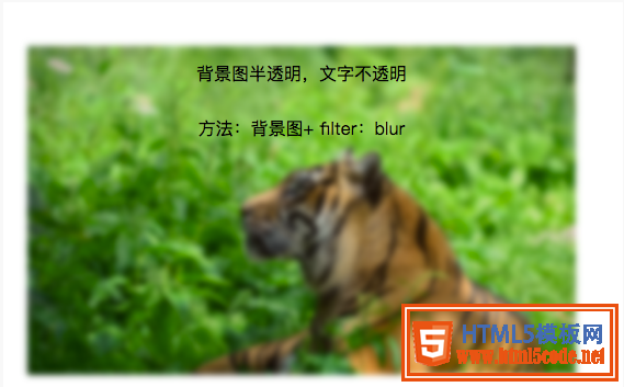
方法一(毛玻璃效果):背景圖 + 偽類 + flite:blur(3px)
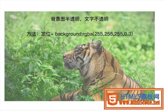
方法二(半透明效果):背景圖 + 定位 + background:rgba(255,255,255,0.3)
CSS實現(xiàn)背景圖片透明,文字不透明效果的兩種方法
項目中經(jīng)常會用到背景圖上放一些文字介紹,這里介紹兩種技術(shù)來實現(xiàn)背景圖片透明,文字不透明效果,記錄一下,方便日后學(xué)習(xí)。
1.毛玻璃效果:
背景圖 + 偽類 + flite:blur(3px)
.demo1{
    width: 500px;
    height: 300px;
    line-height: 50px;
    text-align: center;
}
.demo1:before{
    background: url(http://csssecrets.io/images/tiger.jpg) no-repeat;
    background-size: cover;
    width: 500px;
    height: 300px;
    content: "";
    position: absolute;
    top: 0;
    left: 0;
    z-index: -1;/*-1 可以當(dāng)背景*/
    -webkit-filter: blur(3px);
    filter: blur(3px);
}
<div class="demo1">背景圖半透明,文字不透明<br />方法:背景圖+ filter:blur</div>
2.半透明效果:
背景圖 + 定位 + background:rgba(255,255,255,0.3)
.demo2-bg{
    background: url(http://csssecrets.io/images/tiger.jpg) no-repeat;
    background-size: cover;
    width: 500px;
    height: 300px;
    position: relative;
}
.demo2{
    position: absolute;
    left: 0;
    right: 0;
    top: 0;
    bottom: 0;
    width: 500px;
    height: 300px;
    line-height: 50px;
    text-align: center;
    background:rgba(255,255,255,0.3);
}
<div class="demo2-bg">
    <div class="demo2">背景圖半透明,文字不透明<br />方法:定位+ background:rgba(255,255,255,0.3)</div>
</div>
以上所述是小編給大家介紹的CSS實現(xiàn)背景圖片透明而文字不透明效果的兩種方法,希望對大家有所幫助,如果大家有任何疑問請給我留言,小編會及時回復(fù)大家的。在此也非常感謝大家對網(wǎng)站的支持!
【網(wǎng)站聲明】本站除付費(fèi)源碼經(jīng)過測試外,其他素材未做測試,不保證完整性,網(wǎng)站上部分源碼僅限學(xué)習(xí)交流,請勿用于商業(yè)用途。如損害你的權(quán)益請聯(lián)系客服QQ:2655101040 給予處理,謝謝支持。