效果圖:
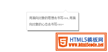
方法一的效果圖:

方法二的效果圖:
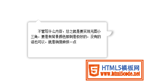
方法三的效果圖:
方法1:因為有背景,所有實(shí)現(xiàn)起來比較方便,尖角的內(nèi)部同個顏色就可以不用考慮遮擋問題
html:
<div id="first">
<p>帶背景顏色的小三角實(shí)現(xiàn)是比較簡單的!</p>
  <span id="top"></span>
</div>
css
#top {

    position: absolute;
    width: 0px;
    height: 0px;
    line-height: 0px;/*為了防止ie下出現(xiàn)題型*/
    border-bottom: 10px solid #89b007;
    border-left: 10px solid #fff;
    border-right: 10px solid #fff;
    left: 76px;
    top: -10px;
}
#first {
    border-radius:8px;
    -moz-border-radius:8px;-ms-border-radius:8px;-o-border-radius:8px;-webkit-border-radius:8px;
    position: absolute;
    height: 150px;
    width: 300px;
    background: #89b007;
    left: 22px;
    top: 33px;
}
#first p{ padding:10px; line-height:1.5; color:#FFF;}
方法2:
html
<div class="w">
<div class="x">
<p><a href="#">用面向?qū)ο蟮乃枷肴鴮慶ss,用面向?qū)ο蟮男膽B(tài)去書寫css。</a></p>
<span class="z">◆</span> <span class="y">◆</span> </div>
</div>
css
* {
margin: 0;
padding: 0;
}
a{ color:#666; text-decoration:none; line-height:25px; text-indent:24px;}
.w{ width:200px; position:absolute; background:#999; left:400px; top:200px; font-size:12px; text-align:left}/*模擬灰色陰影背景層*/
.x{ width:180px; position:relative; background:#fff;  border:1px solid #ccc; padding:10px; left:-4px; top:-4px;}/*內(nèi)容div*/
.y , .z{
position: absolute;
left: 141px;
}
.y{
color: #ccc;
font-size: 19px;
top:-12px;
z-index:1;
}/*模擬小三角*/
.z{
color: #fff;
font-size: 19px;
top:-11px;  z-index:3;
}/*模擬小三角*/
方法3:
<div id="content"> <span class="out"></span><span class="iner"></span> <span class="right"></span>
  <p>不管寫什么內(nèi)容,總之就是要實(shí)現(xiàn)無圖小三角,要是有背景顏色那倒是極好的,沒有的話也可以,就是稍微麻煩一點(diǎn)</p>
</div>
#content {
text-indent: 2em;
box-shadow: 0px 0px 10px #999;
padding: 10px;
font-size: 12px;
line-height: 1.5;
border-radius: 5px;
height: 100px;
width: 250px;
position: relative;
margin: 200px auto;
border: 1px solid #CCC;
}
span {
position: absolute;
left: 25px;
height: 0px;
width: 0px;
}
/*上部小三角實(shí)現(xiàn)樣式開始*/
span.out {
line-height: 0;
border-width: 10px;
border-color: transparent transparent #CCC transparent;
border-style: dashed dashed solid dashed;
top: -20px;
}
span.iner {
border-width: 10px;
border-color: #fff transparent #FFF transparent;
border-style: dashed dashed solid dashed;
top: -19px;
line-height: 0;
}
/*右部小三角實(shí)現(xiàn)樣式開始*/
span.right {
background: #FFF;
border-width: 1px;
width: 16px;
height: 16px;
border-color: #CCC #CCC transparent transparent;
border-style: solid solid dashed dashed;
left: 270px;
top: 30px;
border-radius: 0 0 100% 0;/*這里radius的值不要選取絕對值因為在放大或者縮小的過程中會產(chǎn)生封不住口的現(xiàn)象*/
line-height: 0;
box-shadow: 5px 0 10px #aaa;
}
好了,以上所述是小編給大家介紹的CSS實(shí)現(xiàn)頁面的尖角、小三角、不同方向尖角的方法小結(jié),希望對大家有所幫助。
【網(wǎng)站聲明】本站除付費(fèi)源碼經(jīng)過測試外,其他素材未做測試,不保證完整性,網(wǎng)站上部分源碼僅限學(xué)習(xí)交流,請勿用于商業(yè)用途。如損害你的權(quán)益請聯(lián)系客服QQ:2655101040 給予處理,謝謝支持。