代碼和效果圖如下:
<!DOCTYPE html>
<html>
    <head>
        <meta charset="utf-8" />
        <title></title>
        <style type="text/css">
            .tooltips {
                position: relative;
                width: 300px;
                height: 80px;
                line-height: 60px;
                background: #D7E7FC;
                border-radius: 4px;
            }
            .arrow {
                position: absolute;
                color: #D7E7FC;
                width: 0px;
                height: 0px;
                line-height: 0px;
                border-width: 20px 15px 0;
                border-style: solid dashed dashed dashed;
                border-left-color: transparent;
                border-right-color: transparent;
                bottom: -20px;
                right: 50%;
            }
            .tooltips {
                position: relative;
                width: 300px;
                height: 80px;
                line-height: 60px;
                background: #D7E7FC;
                border: 1px solid #A5C4EC;
                border-radius: 4px;
            }
            .arrow {
                position: absolute;
                width: 0px;
                height: 0px;
                line-height: 0px;
                border-width: 20px 15px 0;
                border-style: solid dashed dashed dashed;
                border-left-color: transparent;
                border-right-color: transparent;
            }
            .arrow-border {
                color: #A5C4EC;
                bottom: -20px;
                right: 50%;
            }
            .arrow-bg {
                color: #D7E7FC;
                bottom: -19px;
                right: 50%;
            }
        </style>
    </head>
    <body>
        <!--先定義一個相對定位的盒子div:-->
        <div class="tooltips">
            <!--給div盒子添加一個三角型圖標-->
            <div class="arrow "></div>
            <!--給“小三角穿上松緊帶”需要使用兩個三角形疊加的方式-->
            <!--首先我們定義兩個三角形的div,一個背景色和盒子的邊框顏色相同,一個背景色和盒子的背景色一致:-->
            <div class="arrow arrow-border"></div>
            <div class="arrow arrow-bg"></div>
            <!--注意:.arrow-bg和.arrow-border的bottom位置相差為1px(可根據邊框寬度調整)兩個div的順序不可顛倒。-->
        </div>
    </body>
</html>
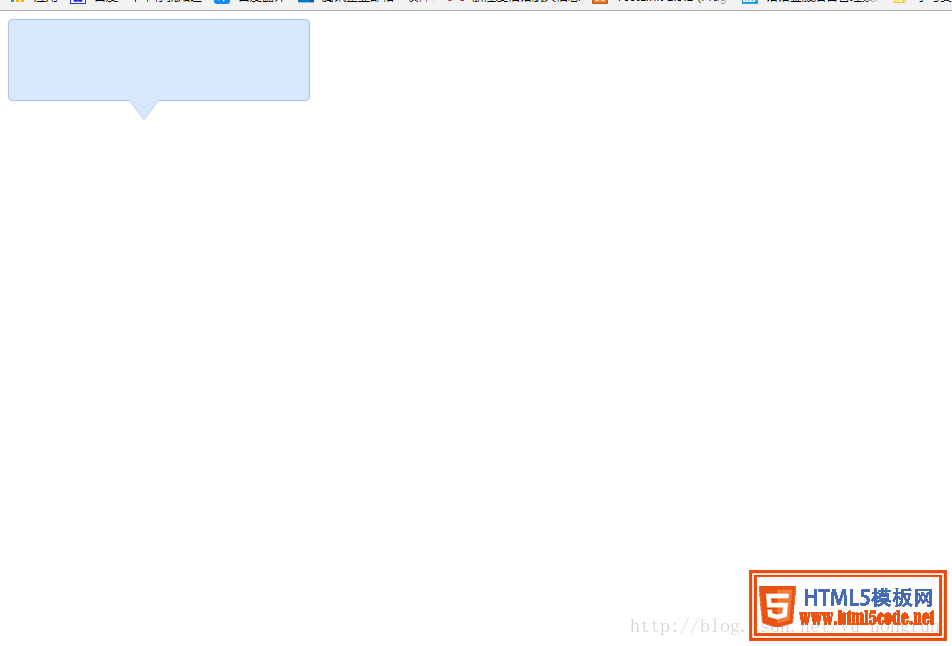
效果展示圖
總結
以上所述是小編給大家介紹的 div+css樣式自制帶小三角的tooltips效果,希望對大家有所幫助,如果大家有任何疑問請給我留言,小編會及時回復大家的。在此也非常感謝大家對網站的支持!
【網站聲明】本站除付費源碼經過測試外,其他素材未做測試,不保證完整性,網站上部分源碼僅限學習交流,請勿用于商業用途。如損害你的權益請聯系客服QQ:2655101040 給予處理,謝謝支持。