styled components 一種全新的控制樣式的編程方式,它能解決 CSS 全局作用域的問題,而且移除了樣式和組件間的映射關系
import React from 'react';
import styled from 'styled-components';
import { render } from 'react-dom';

const Title = styled.h1`
    font-size: 1.5em;
    text-align: center;
    color: palevioletred;
`;

class App extends React.Component {
    render() {
        return (
            <Title>Hello world</Title>
        )
    }
}

render(
    <App />,
    document.getElementById('app')
);
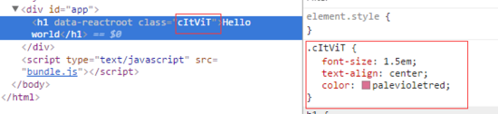
styled.h1 是一個標簽模板函數
styled.h1 函數返回一個 React Component , styled components 會為這個 React Component 添加一個 class ,該 class 的值為一個隨機字符串。傳給 styled.h1 的模板字符串參數的值實際上是 CSS 語法,這些 CSS 會附加到該 React Component 的 class 中,從而為 React Component 添加樣式
二、基于 props 定制主題
const Button = styled.button`
  background: ${props => props.primary ? 'palevioletred' : 'white'};
  color: ${props => props.primary ? 'white' : 'palevioletred'};
  font-size: 1em;
  margin: 1em;
  padding: 0.25em 1em;
  border: 2px solid palevioletred;
  border-radius: 3px;
`;

render(
  <div>
    <Button>Normal</Button>
    <Button primary>Primary</Button>
  </div>
);
我們在組件中傳入的所有 props 都可以在定義組件時獲取到,這樣就可以很容易實現組件主題的定制。如果沒有 styled-components 的情況下,需要使用組件 style 屬性或者定義多個 class 的方式來實現
三、組件樣式繼承
通常在 css 中一般會通過給 class 傳入多個 name 通過空格分隔的方式來復用 class 定義,類似 class="button tomato" 。在 styled-components 中利用了 js 的繼承實現了這種樣式的復用:
const Button = styled.button`
  color: palevioletred;
  font-size: 1em;
  margin: 1em;
  padding: 0.25em 1em;
  border: 2px solid palevioletred;
  border-radius: 3px;
`;

const TomatoButton = Button.extend`
  color: tomato;
  border-color: tomato;
`;
子組件中的屬性會覆蓋父組件中同名的屬性
四、組件內部使用 className
在日常開發中總會出現覆蓋組件內部樣式的需求,你可能想在 styled-components 中使用 className ,或者在使用第三方組件時。
<Wrapper>
  <h4>Hello Word</h4>
  <div className="detail"></div>
</Wrapper>
五、組件中維護其他屬性
styled-components 同時支持為組件傳入 html 元素的其他屬性,比如為 input 元素指定一個 type 屬性,我們可以使用 attrs 方法來完成
const Password = styled.input.attrs({
  type: 'password',
})`
  color: palevioletred;
  font-size: 1em;
  border: 2px solid palevioletred;
  border-radius: 3px;
`;
在實際開發中,這個方法還有一個有用處,用來引用第三方類庫的 css 樣式:
const Button = styled.button.attrs({
  className: 'small',
})`
  background: black;
  color: white;
  cursor: pointer;
  margin: 1em;
  padding: 0.25em 1em;
  border: 2px solid black;
  border-radius: 3px;
`;
編譯后的 html 結構如下:
<button class="sc-gPEVay small gYllyG">
  Styled Components
</button>
可以用這種方式來使用在別處定義的 small 樣式,或者單純為了識別自己定義的 class ,因為正常情況下我們得到的 class 名是不可讀的編碼
六、CSS 動畫支持
styled-components 同樣對 css 動畫中的 @keyframe 做了很好的支持。
import { keyframes } from 'styled-components';
const fadeIn = keyframes`
  0% {
    opacity: 0;
  }
  100% {
    opacity: 1;
  }
`;

const FadeInButton = styled.button`
  animation: 1s ${fadeIn} ease-out;
`;
七、兼容現在已有的 react components 和 css 框架
styled-components 采用的 css-module 的模式有另外一個好處就是可以很好的與其他的主題庫進行兼容。因為大部分的 css 框架或者 css 主題都是以 className 的方式進行樣式處理的,額外的 className 和主題的 className 并不會有太大的沖突
styled-components 的語法同樣支持對一個 React 組件進行擴展
const StyledDiv = styled(Row)`
  position: relative;
  height: 100%;
  .image img {
    width: 100%;
  }
  .content {
    min-height: 30em;
    overflow: auto;
  }
  .content h2 {
    font-size: 1.8em;
    color: black;
    margin-bottom: 1em;
  }
`;
缺點
不能用 stylelint 檢查你的 Css 代碼