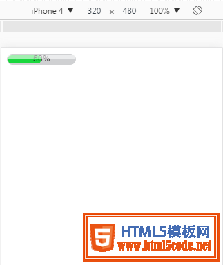
這里只是一個小demo,一個用CSS3寫的進度條。
如圖所示:
具體代碼如下:
<!DOCTYPE HTML PUBLIC "-//W3C//DTD HTML 4.01//EN" "http://www.w3.org/TR/html4/strict.dtd">
<html>
<head>
<title> new document </title>
<meta http-equiv="Content-Type" content="text/html; charset=utf-8"   />
<meta name="viewport" content="initial-scale=1">
<style>
.process-bar
{
    width:100px;
    display:inline-block;
    *zoom:1;
}
.pb-wrapper
{
    border:1px solid #cfd0d2;
    position:relative;
    background:#cfd0d2;
    border-radius: 8px;
}
.pb-container
{
    height:12px;
    position:relative;
    left:-1px;
    margin-right:-2px;
    font:1px/0 arial;
    padding:1px;
}
.pb-highlight
{
    position:absolute;
    left:0;
    top:0;
    _top:1px;
    width:100%;
    opacity:0.6;
    filter:alpha(opacity=60);
    height:6px;
    background:white;
    font-size:1px;
    line-height:0;
    z-index:1
}
.pb-text
{
    width:100%;
    position:absolute;
    left:0;
    top:0;
    text-align:center;
    font:10px/12px arial;
    color:black;
    font:10px/12px arial
}
</style>
</head>
<body>
    <div class="process-bar skin-green">
        <div class="pb-wrapper">
            <div class="pb-highlight"></div>
            <div class="pb-container">
                <div class="pb-text">50%</div>
                <div class="pb-value" style="height: 100%;width: 50%;background: #19d73d;border-radius: 8px;"></div>
            </div>
        </div>
    </div>
</body>
</html>
以上所述是小編給大家介紹的使用CSS3制作一個簡單的進度條(demo),希望對大家有所幫助,如果大家有任何疑問請給我留言,小編會及時回復大家的。在此也非常感謝大家對網站的支持!
【網站聲明】本站除付費源碼經過測試外,其他素材未做測試,不保證完整性,網站上部分源碼僅限學習交流,請勿用于商業用途。如損害你的權益請聯系客服QQ:2655101040 給予處理,謝謝支持。